With Climate and Vegetation Data, UCSB Geographers Closer to Predicting Droughts in Africa
What might happen if droughts were predicted months ahead of time? Food aid and other humanitarian efforts could be put together sooner and executed better, say UC Santa Barbara geographers Chris Funk, Greg Husak, and Joel Michaelsen. After over a decade of gathering and analyzing climate and vegetation data from East Africa, the researchers, who are part of the U.S. Agency for International Development's Famine Early Warning System Network (FEWS NET), say there is enough evidence to associate climate conditions in the region with projected rainfall deficits that could lead to food shortages.
"We've been looking at climate in East Africa and trying to relate that back to patterns in sea surface temperatures, rainfall, and winds over the Indian and Pacific oceans," said Funk, who analyzes and predicts large-scale climate anomalies in Africa. Results show that over the last 14 years, the number of droughts has doubled in East Africa. Roughly half of the last 14 years have been drought years.
"We've been worried about these trends for a long time," said Michaelsen, who studies the patterns of vegetation greening and browning in the area. "This year marks a bit of a watershed because we're starting to understand more the specific structure of these droughts, which is what underlay our early warning projections this year."
Through the climate data, coupled with satellite data that has recorded the patterns of vegetation greening and browning over the last decade, the researchers have detected a pattern that points to the likelihood of water shortages months ahead of time –– a pattern the U.S. government is taking seriously. A recent alert from the government-run USAID agency has taken into account FEWS NET's projection of the likelihood of low rainfall this March-May rainy season in East Africa, as USAID prepares its outreach efforts.
"It's already a billion-dollar problem that they're thinking needs $50 million more; they're already anticipating a 5 percent increase in the need for aid," said Husak, who specializes in analyzing remote sensing data and rainfall. The area, which includes chronically food-insecure countries like Ethiopia and Somalia, is still recovering from last year's famine.
The U.S. government spends more than a billion dollars in food aid every year. FEWS NET was created after the 1984-1985 Ethiopian famine, an event that killed over a million people before sufficient food aid could be airlifted into the country. FEWS NET has since become a leader in integrating monitoring, forecasting, and climate trends analysis.
Famine, say the researchers, is the result of more than severe climate: Conflict, political unrest, corruption, and other human factors are also major contributors to the crisis. Additionally, relief is not just a matter of putting food on a boat and distributing it among the locals. If food aid is sent to a place that doesn't need it, the surplus could distort the local market by devaluing the prices of local products. Conversely, not providing food aid quickly enough distorts the market in the other direction, limiting access to available resources.
"Prices of food have gone up," said Michaelsen. "It's not the brownness (of the vegetation) that causes food insecurity; it's the price of food." The challenge, say the geographers, will be for aid agencies to determine where their finite resources will go.
In the long term, and with more information, Michaelsen, Husak, and Funk, along with the extensive network of colleagues in FEWS NET, hope to gain a better understanding of the effects the changing climate will have on the abilities of a region –– and the agencies that support it –– to prevent future crises.
"There are going to be a lot of surprises, and how agile we are at responding to those surprises is going to make a big difference," said Michaelsen.
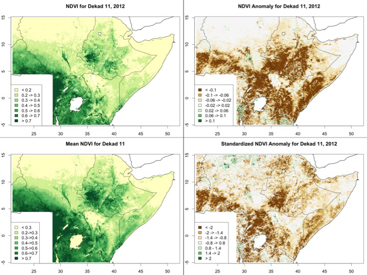
† Top image: The top map on the left represents the current normalized difference vegetation index (NDVI) conditions (April 11-20, 2012), and the bottom left is the average for this time of year.
The top right map is the difference between the top (current) and bottom (normal) on the left, and the bottom right map is the "significance" or "z-score" of that difference.
Credit: Joel Michaelsen
Related Links


