Climate Beliefs, Quantified

A vast majority of Americans — 70 percent according to recent research — think global warming is indeed happening. That’s encouraging for climate scientists, but the number doesn’t paint a complete picture.
To understand what people in each county, city and even congressional district in the United States believes about climate change, requires an extremely detailed, easily navigable opinion map.
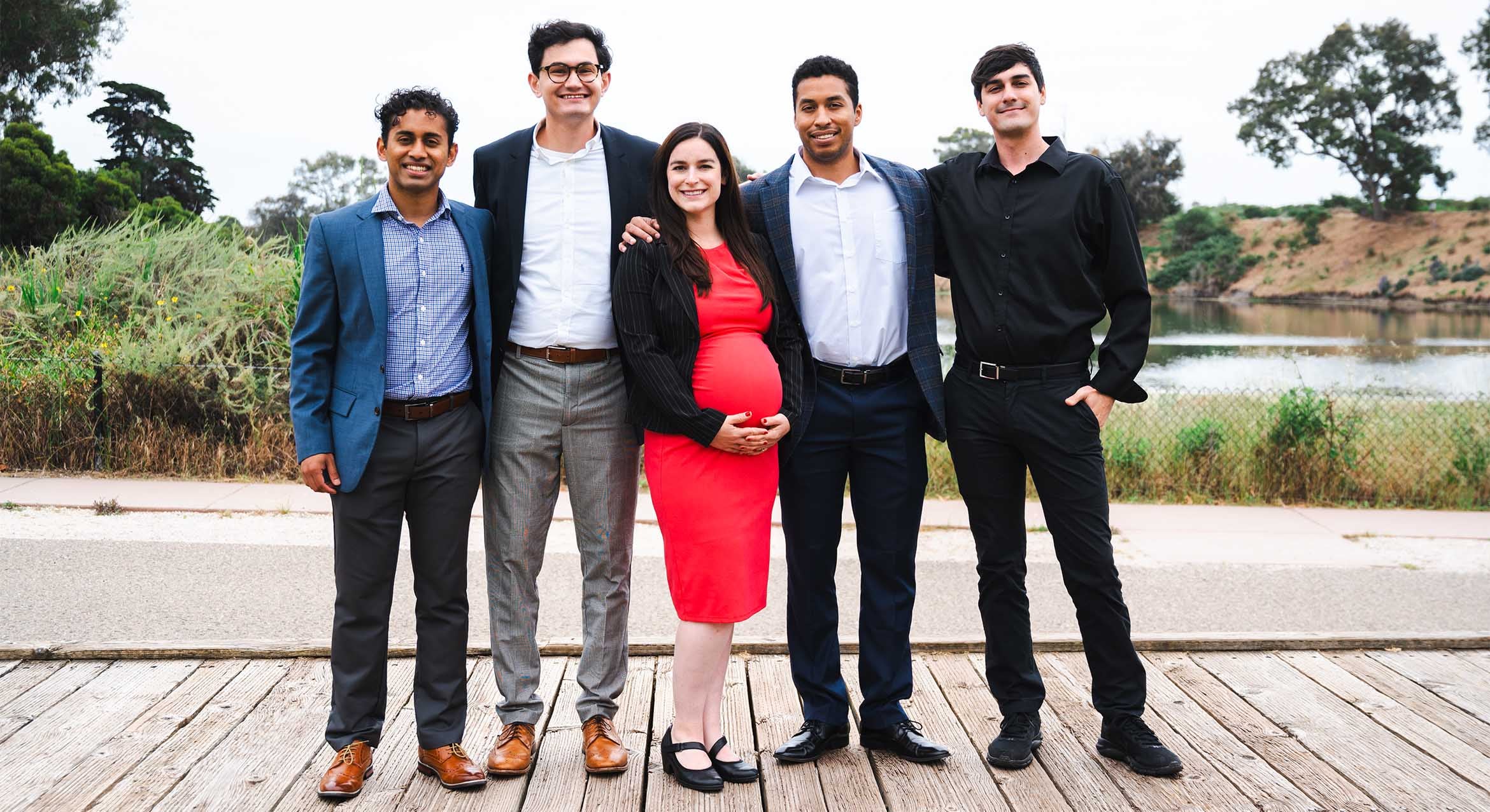
Enter Matto Mildenberger, an assistant professor of political science at UC Santa Barbara, who knows well the challenges of creating a tool that accurately reflects the beliefs of disparate areas within the U.S. He was a key player on the team that has made just such a map.
Mildenberger, a member of the Yale Program on Climate Change Communication, was a driving force behind collecting the data and creating a model (the Yale Climate Opinion Maps) that details climate energy beliefs at every level — from the national down to the hyper-local.
“The impetus for the project was that much of our understanding of the distribution and dynamics of public belief ends up relying on national surveys, and sometimes state polls, but we don’t really have a good understanding of the variation in beliefs and opinions at a local scale,” said Mildenberger. “These smaller political geographies are relevant for both political decision-making around climate change and adaptation and policy planning.”
The group’s goal was to create maps — using data they collected, estimated and validated — that could effectively detail public perception of the issues surrounding global warming and climate change. Mildenberger, who worked closely with Peter Howe of Utah State University and other scientists, said that though the maps could benefit policymakers, they were not developed with a single audience in mind.
“There are a number of audiences, including a big research audience,” he explained. “We see our role not as being advocates, but as providing objective information using the best possible quantitative techniques on the distribution of this opinion.” In fact, the data is available for anyone to download.
Data for the Yale Climate Opinion Maps — and the model used to produce them — was drawn from a large national survey of more than 18,000 people. That survey asked respondents multiple questions about their climate beliefs, including risk perceptions (i.e., how worried they were about the potential harm global warming could cause), their support for different policies (such as renewable energy and regulating carbon dioxide omissions), and even their common behaviors (whether they discussed global warming on a regular basis, for example).
The map tool allows the aggregated responses to each question to be broken down by metro area, county and even congressional district. Examining all of the data, some trends start to emerge.
“In working with this data, I found the sense that there was stronger support for a number of climate policy responses than I might have expected in a broader variety of places,” said Mildenberger. “It allows us to have a more nuanced understanding of how the U.S. is divided on this issue, and where there might be support for various mitigation and adaptation measures to protect Americans from dangerous human-caused climate change.”
Mildenberger says that careful analysis of the mapping tool could be beneficial to politicians wondering whether a bill about carbon emissions or climate policy might have support in a given geographic area. “In some sense, the data can help us to understand the degree to which there is a disconnect between public climate policy preferences and the representation of those preferences in Congress,” he explained.
The maps show that many politicians likely would have the support they needed to pass climate protection measures in their districts. “I think the data highlights the fact that there is substantial heterogeneity in climate beliefs and energy beliefs across the country,” said Mildenberger. “There are some policies and some opinions that are much more widespread in their distribution than popular media or conventional wisdom suggests. Even in this highly polarized environment, there are still some policies where we see majority support in every congressional district.”
One major takeaway from the Yale Climate Opinions Maps, Mildenberger said, is that many Americans feel removed from climate change, both in time and distance.
“Looking at the maps, we can see that climate change is still perceived by many Americans as distant,” remarked Mildenberger. “We should expect that people’s perceptions and opinions of the impact of climate change on their lives would have a spatially resolved dimension. Hopefully, that’s a signal that this dataset and this work will slowly pick up over time as different communities become more engaged in the issue.”


